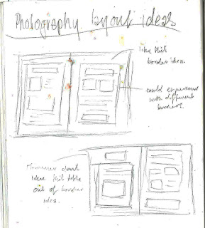
These are some ideas that I started to sketch in my book. I really like the idea of the border in the first one and I am going to try and experiment with border effects.
For my photography layout I started experimenting a lot with different effects on photoshop and seeing what I wanted for my background border for my text and photographs to go on. I chose this torn paper because of a video from what I watched in youtube that inspired me to use this brush effect.
Heres an example of torn edges used in a magazine article. I really like this effect because it gives more texture to the page.
Firstly I created a grey background and made these two boxes for my text and images to go on. I made these boxes have a ripped paper effect by using different brushes in photoshop and I also gave it a faint drop shadow so that the background didn't look so flat.
I then started to experiment with fonts. I downloaded three fonts after searching through dafont that I liked and that I felt would link well with my layout.
As i didn't like the second one as much i was torn between the first one and the third one, I then tried them both out on my layout but felt that the third one called photonica was the best.
I chose the text to be green for Henrik Bonnevier and yellow for Andrea Bricco. Once I had chosen the text I then imported my images and added a 'bevel and emboss' effect to these images to make them more 3d and stand out on the page. I added this effect because when analysing this photograph I felt that the objects used were posh and this effect made the border of the picture look more professional and neat on the page.
This was the placement I chose for my images.
I then inserted my text from my analysis and made sure all my measurements were correct.
This is my final photography layout on Henrik Bonnevier & Andrea Bricco. I am really pleased with this layout because I feel that it looks really neat and professional. However I could of improved by experimenting more with different image placements.


Good layout. Please make sure you annotate it.
ReplyDelete