Tuesday, 10 December 2013

Personal Study Artists


Steve Wilson 

Steven Wilson is an Illustrator who lives and works in Brighton, UK. Originally from North London Steven fell in love with Brighton whilst studying on the renowned Illustration course there. He has a particular passion for working on album covers as he enjoys their permanent nature. "I like the idea that with an album sleeve the artwork is forever associated with that album and so you are creating a little piece of history." Steve Wilson was an artist that I looked at for As-A2 project and was one of my favourites from my summer Pinterest boards. He was also one of the three artist I created an inspired piece for, were I took the Louis Vuitton LV logo and manipulated it into a steve wilson inspired piece in the style of Wilson's Stussy logo design with the paint dripping effect. When first looking at Steve Wilson's work It reminded me a lot of summer and paint because of how he uses bright colour palettes and abstract rounded shapes to create paint dripping effects. During the as-a2 project the first work I saw of Wilson was his typography work which I really loved because of how fun, colourful and unique it was. Recently I have just started to look at his vector image portraits which reminded a lot of miles Donavan's work however I feel Steve Wilson's work is much more crisp and neater than miles Donavan's but really love how Miles Donavan includes paint slats to add much more urban graffiti style to his work.


Miles Donavan 


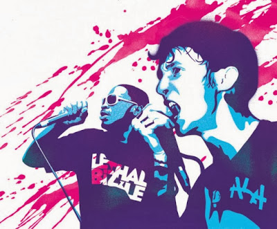
Miles Donovan is an illustrator and graphic design who is a member of peepshow collective. His work has been used internationally for editorial and advertising clients including The New York Times, Creative Review, Newsweek, The Guardian, The Telegraph, TIME, Wired and Qantas. You can find Donovan's illustrations in the books 'Illusive', 'The Fundamentals of Illustration', 'Pen and Mouse' and 'Illustration Play'. With Peepshow Donovan also worked on designs such as, art direction and animation projects for BBC, Nike, Channel Four, Philips, Toyota, Redbee Media, Diesel and The Victoria & Albert Museum. I feel that these vector portraits have been created in photoshop and illustrator because of the vibrant colours and smooth lines that have been used to created different tones on the peoples faces. Most of these portraits in this portfolio are of celebrities such as Rihanna, Lethal Bizzle, Kate Middleton and others. Miles donavon focuses a colour tones to use on faces for different light and dark areas on faces and clothing to show emotion and action in the artwork. Donavon uses a small colour pallet including around 3 tones of Blue, yellows, pinks, reds and green. I really like how Donavon gives an urban feel to the work by adding paint splats and spray paint affects on, around or behind the portraits.


Ewa Mosa

Ewa Mos is a illustrator, graphic design and photographer from copenhagen and has created many different funky and unique photo manipulation pieces of art work for clients such as: Adidas, design wars, fused magazine, don't panic and many more. When looking through Ewa Mos's website I was really quite amazed by how funky and unique her pieces of work are because of how she creates simple high quality digital illustrations. Even though some of these illustrations are simple, the use of vector software has really made these illustrations stand out because the high quality lines and colour along with the high quality photograph. I found this piece below really cool and creative because of how Mos has really made her model make a facial pose so that Mos could fully incorporate the illustration into the photograph. I really like how Mos has create her illustrative squid character follow the lines of the models face and also even look like it is going through the models nose and out the eye. I feel that the more the illustration merges with the photo the less flat and plain the piece of artwork looks. Lighting is also a factor that Mos has taken in to hand because she has use toning and shadow throughout the illustration and create the light and shadows look similar to the ones on the models face. The use of toning has also really made the illustration look much more 3d and less flat on the photo.  


Wednesday, 27 November 2013

Evan Eckard


Evan Eckard is a Graphic Designer from California who focuses mainly now on illustrative design and has also worked in the fields of Front End Web Development and UI/UX Design. He has done many illustrative designs for bands, merchandise, brick & mortar companies and a variety of others. Eckard uses a graphics tablet along with Adobe Illustrator and photoshop to create these amazing clean crisp high quality illustrations. 

When first viewing his work, I really loved how it was really in your face because of the bright colours, bold lines and harsh shapes. I feel Eckards artwork really relates to my band 'Modestep' because of how modesteps genre of music is electric dub step which is known to be a very loud, sharp, expressive and in your face type of genre. I chose to look at this piece of artwork below because I feel that it is one of Eckards pieces of work that most relates to the style I want to go for when designing my website design because of how he has used typography throughout and used red on the black background. I feel that for my website design that I will be experimenting with reds, yellows and oranges on a black design. For this piece of work Eckard has drawn the typography in the background himself and I really like how he has done this because he has gone for a really quick sketched type which I feel goes well with the bear image because of how bears cause destruction by scratching into trees etc which looks a lot like the lettering. Eckard has also used this bloody red which is really high contrast and jumps out on the black background.


Throughout eckards work, he focuses a lot on bold black lines and shapes to form his illustrations. He uses bold cut outs to create the image and then adds detail by using finer brush strokes to take away parts of shapes. You can see this especially around the mouth and nose of the bear. I really love how even though Eckard has used a small colour palette in this image by just using a gradient green to white, reds, blacks and whites. I really like how he has added subtle shading and toning to show the lighter parts of the bears face such as around the cheeks, nose and forehead.  

Tuesday, 26 November 2013

Personal Project Artist/Company Inspiration


I have been looking at these artists because I feel I want to develop, experiment and maybe use digital illustration and vector image techniques and styles in my final website design. I really enjoyed creating a vector portrait in the As - A2 project inspired by Miles Donavan because I felt it turned out really well. I have also chosen to look at digital illustrative artist such as Evan Eckard as well because of how his work is really colourful, expressive and loud just like Modestep's music. Evan Eckard also has done illustrations for Cd packaging and I feel his illustrative skills will inspire me when creating my website design. Brandshank are a website design company and I have chosen to look at them because they work with many recording artist and their designs will really inspire my layout choices for my website design I choose.

Miles Donavan - Illustrator/ Art Director


Evan Eckard - Illustrator/ Web Developer


Brand Shank - brandshank.com 


Word Cloud


Tuesday, 19 November 2013

Evaluation


For my final Cd packaging I created a 2 fold Cd package with a slot for the Cd to be placed in. It included a full in side sunset surface design with the Cd being the centre focus. It also included a typography lyric design which included the lyrics from the song, a font cover with eye design and a back cover with barcode and record company logo.

For my CD packaging design I decided to use digital techniques to be able to create a high quality final project design. I used techniques such as gradient, blending, blurring, manipulating photographs, creating silhouettes and also experimenting with typography. To help and inspire me with this project, I looked at artists such as David Carson typography work and Olafur Eliasson’s weather project. I also looked at album covers and record labels such as Mika - Life in cartoon motion, Madonna - Celebration, Wynter Gordon - With the music I will die, David Bowie vinyl covers, Ministry of Sound, Def Jam and Island records.

I really liked working and creating my Cd packaging and I felt that my inside design and typography lyric sheet turned out really well. I really like my Inside sunset design because I worked really hard on creating the sunset to look warm, bright and to add depth to the inside layout. I feel that my Cd packaging was a success and feel that It was because of how I didn't rush the inside layout and tried lots of different effects. However I feel that could of spent more time at the start of the project brainstorming more ideas for nets because even though my net did turn out well, I feel that I could of created a much more technical and unique net instead of a simple 2 fold net. If I had more time and changed the net I feel that I would of created a small booklet addition to the Cd packaging which would include the lyrics, information about the band and also maybe small vector images of the band members. In this project I completed all the work set, however I feel that some of it could of been better and I could've gone further with developing other ideas.

In this project I felt I learnt many skills through testing different experiments on photoshop. I know feel much more comfortable and faster with photoshop which will hopefully help me in future projects such as my personal project which is next. I also feel I improved my typographic skills by looking more at David Carson's work and creating my own typographic lyric sheet.